September 2024 Update
It’s been a while since I posted on my blog! I’ve been wanting to write some
articles, but I did not have any fleshed-out ideas, hence the break. I keep
seeing the same advice from bloggers and other writers on the Internet: Just
start writing!
What to write about, though? Anything!
The first thought I had when I opened my text editor to write this post was that it’s been a while since I wrote something, might as well write about what happened in the meantime!
Since I wrote my last blog post, I’ve been busy with finishing my bachelor’s
degree, summer holidays, and starting my master’s. I’m thankful for my thesis
supervisor, who gave me plenty of freedom, which led to a thesis about Ken
Thompson’s “Trusting Trust” attack and reproducible builds.
I attacked the (then) latest version of the Go compiler to target Go’s own
reproducibility checker took, gorebuild. Ironically enough,
there are no official, (sidenote:Or at least hashed.) gorebuild binaries, so targetting it with such an attack is
actually practical: the “official” way to install gorebuild is to just compile
it from source. My attack changed the compiler to make it detect when
it’s compiling gorebuild to then change its logic to lie to the user that the
attacked compiler actually matches the official hashes as published on the Go
website. It is on my list to write a nice post about this attack and challenges
I encountered. If you find this interesting, you might be interested in reading
my thesis here. There are some extras in there too, such as evilgen
— (sidenote:
It generates source code that can regenerate itself. The source code is in the repo, together with some examples.
) — and some code examples.
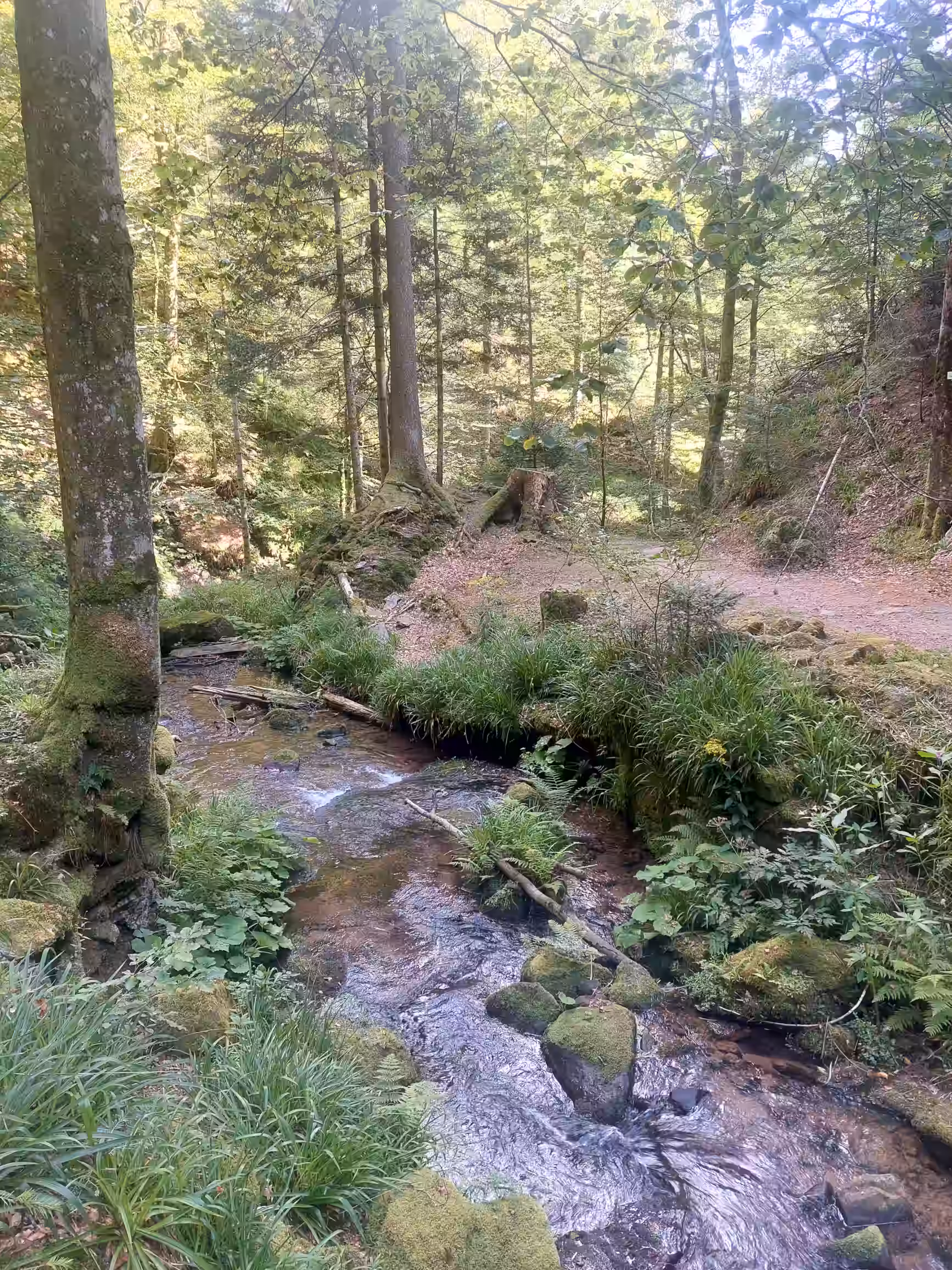
After I was done with the academic year, I went on a five week-long holiday to Romania and Germany. Of those five weeks, three were spent without my laptop, which really gave my mind some rest after all the studying. Visited family, saw some nature, hiked; great holiday all-around.
Another thing that I felt was lacking is that my blogging setup did not fully reflect the way I think, which made writing feel not that great. I took inspiration from other websites, pondered a bit, and I realised that what I needed all this time were sidenotes. You can see them in action on this page! I wanted to have a way to mention all the tid-bits and fun facts and little details that I like to mention when I have a conversation, because these are all things that can make a discussion even more interesting.
Normally one might use footnotes for that, but I find them quite distracting on websites, actually. On paper you can switch you gaze really quickly between the body text and the footnotes, but on screens — especially little ones — that is not the case, in my opinion1. A web page has an arbitrary length, of which only (sidenote:The viewport.) is actually displayed to your eyes. I find it really easy to lose the position I’m at in the text when I look at a footnote on the web — it’s not like I can just leave my finger there and then take a quick look at the bottom of the screen. There are ways to improve this, like having the footnote indicator be a link that makes your browser scroll enough to bring it on the screen. Some cleverer implementations even have a link that sends you back right at the end of the footnote. But then the line containing the footnote will be stuck to the top of your browser window, which is also very annoying!
But this still doesn’t fix my main gripe I have with footnotes on the web: they require you to move the page around! It’s annoying, it’s confusing and dizzying even, and this is the web after all; we can make good use of the differences between the two media. One of them is that desktop screens are wide: there is plenty of space for some notes that go along with the text. On phones, one may use CSS to make the sidenotes inline. I actually made them interactive on my website for a reason: phones are pretty small, and can only display a limited amount of text when using a decent font size. I wanted to have the body text have priority when using this space, and let the reader optionally reveal the notes by tapping on the associated text. I figured this may not be the most discoverable UI, so I just put a note at the top of the page that is only visible when using a narrow screen.
The sidenotes also render perfectly fine in reader mode, and (sidenote:I haven’t tested that, yet.). My main inspiration for my implementation was this article by Koos Looijesteijn. I implemented the sidenotes as a JSX component, and I used Tailwindcss for the styling. My website is completely statically-generated, there is no JSX on your browser right now, don’t worry! You can find the source code for this component here.
If you have any suggestions, praise, (constructive) criticism or just want to say something about my sidenotes, I’d be very happy to read about it! You may send me an e-mail or a message on Mastodon, check the home page for links!
Next to all of that, I started a new study at the university: the Computer Security master’s degree. It’s about low-level systems security! It’s currently going well, I really like it, I feel like I’m already learning a ton. I’m excited for the courses that come next! I really want to write more here, I’ll see how that goes: the study is keeping me rather busy. Till next time!
Footnotes
-
See? ↩